Which Season Are You?
Seasonal color analysis groups everyone into one of four color palettes, inspired by the seasons. This concept uses color theory to determine which clothing colors are the most flattering for different features and can be a helpful guide for those wanting to refine their wardrobe. Here, we take a look at the components of seasonal color analysis and offer some tips and tricks for finding your season.
Figuring out which season you are is as simple as determining where you fall in the following three categories. Once you have your results, read on to find the season you line up with and learn more about its color palette.
Hue | Cool vs. Warm
Hue refers to your undertone, which can be cool-toned or warm-toned. If your hair has golden tones, that signals warmth. Meanwhile, ashy hair leans cool. Another tip is to consider the jewelry you gravitate towards. Silver jewelry complements cool undertones while gold complements warm.
Value | Light vs. Dark
Value is determined by your overall coloring, with hair color being the best indicator. Simply consider whether your hair color is lighter or darker.
Chroma | Bright vs. Muted
Chroma involves how saturated a color is. To figure out whether bright colors or muted suit you best, look at the contrast between your features. Bright chromas will have a sharp contrast between their features, while muted will have a soft blend.
While these categories are a good rule of thumb to figuring out your season, there are always exceptions. Experiment with different colors to discover what makes your features shine and consider seasonal color analysis a starting point for finding the color palette that makes you most confident.
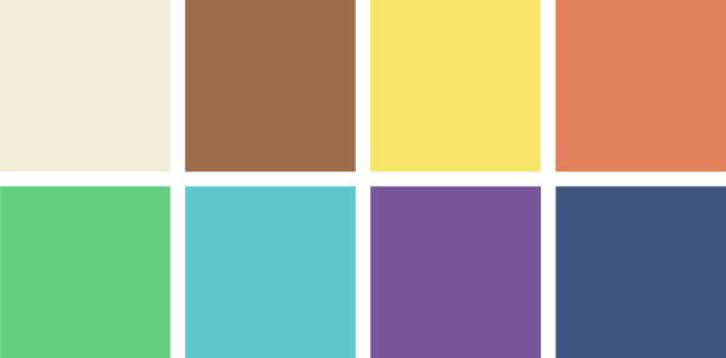
Spring
Warm | Light | Bright
The spring palette is comprised of a wide range of fresh, vibrant colors that mirror this season’s blooming flowers. These highly saturated hues pair perfectly with the glow of springs. They include bright yellows, vivid greens and blues, and coral pinks, which are best paired with light neutrals such as cream and tan.
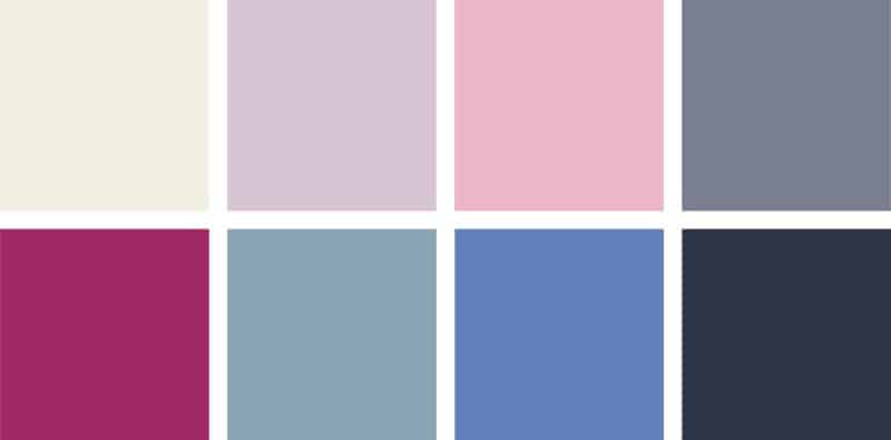
Summer
Cool | Light | Muted
The summer palette is reminiscent of the ocean and its many shades of blue. Because strong shades can overwhelm the softness of summers, this palette features smokey and subtle colors that highlight their features. Cool colors take center stage, including dusty pinks, purples, and blues, complemented by neutrals such as gray and navy.
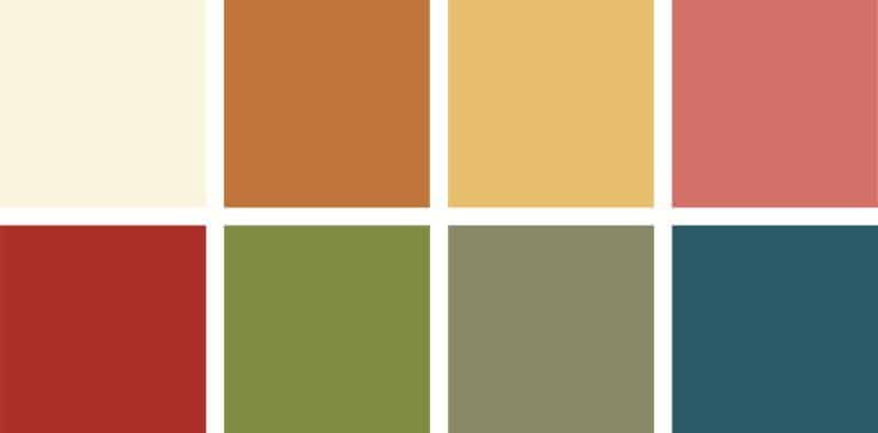
Autumn
Warm | Dark | Muted
The autumn palette consists of earthy shades found in nature and its falling leaves. These natural hues are well suited to the soft features of autumns and help bring out the warm highlights in their hair and eyes. Complementary colors include olive greens, golden yellows, and rich oranges and reds, along with neutrals like beige and brown.

Winter
Cool | Dark | Bright
The winter palette brings to mind frosty weather and holiday décor with its cool and vibrant colors. Contrast is the defining feature of winters, and a color palette of bright and bold jewel tones provides a striking complement. These include emerald green, sapphire blue, and deep purples and reds, paired with black and white.