From painting a room to choosing impactful accents, understanding the effects of color can go a long way toward helping you fine-tune your home’s atmosphere. Different colors can have unique effects on your mood and psyche. It is beneficial to cultivate an environment that supports your mental and emotional health, so read on for facts about a broad spectrum of choices.
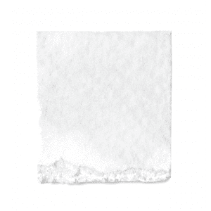
White
White is considered a cool color and can be viewed as sterile, bland, or void. However, this color can also be seen as clean, fresh, and relaxing. It is often chosen in home design to convey simplicity and spaciousness. White is a great choice for ceilings (to add height), for kitchens and bathrooms (to create a sense of cleanliness), and for smaller spaces like hallways or laundry rooms that you’d like to feel larger.
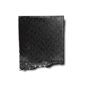
Black
Black is a cool color that absorbs every other light in the color spectrum. In home design, it is usually associated with sophistication and balance. Black will cause a space to feel more intimate and ceilings to feel lower, and it can also be used to add a dramatic accent. It works well to balance and ground lighter spaces.
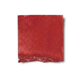
Red
Red is a warm color that tends to evoke strong emotions. It can stimulate conversation and conjure excitement, intensity, and even anger. It can also call forth feelings of love and romance, warmth, confidence, and comfort. Selecting various shades of red or using it as an accent color can help you avoid overwhelming the senses.
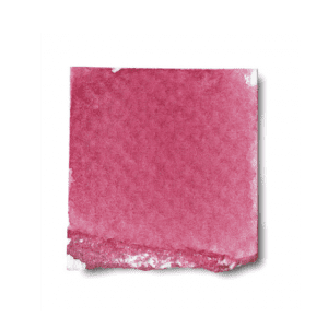
Pink
This is another warm color that creates sensations of calmness and love. In lighter shades, pink is often seen as relaxing, while brighter shades can slip into aggravating tones. Pink is also known to inspire feelings of creativity and joy. Choosing the appropriate shade and opting for smaller spaces, such as a bedroom or bathroom, can make a statement without overdoing it.
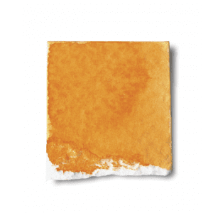
Orange
Enthusiasm, warmth, and energy can all be created by this stimulating shade. Orange is thought to promote conversation and draw attention, which make it a great choice for an entertaining space. However, it can be overwhelming if used liberally or in exceptionally bright shades. Try incorporating orange in an accent wall or in your table design.
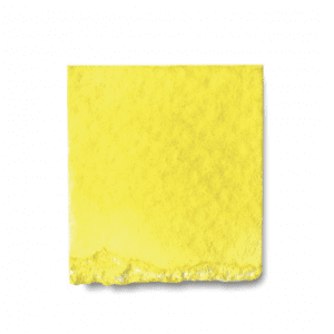
Yellow
Energetic and joyful, yellow is a popular choice in home décor. Yet when used in excess or very bright shades, this color is known to create feelings of anxiety and irritation. It can also cause eye strain over time. The goal is to choose a pleasing shade of yellow or use bright bursts sparingly.
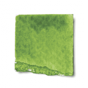
Green
Associated with nature, green tends to create feelings of tranquility, luck, and health. In the right shade, green is a wonderful neutral color that can blend with a variety of partners on the color wheel.
Blue
Blue is another cool color which, like green, can be used as a very pleasant neutral. Many shades of blue, from dark to light, can promote calmness and productivity, making it an ideal choice for an office, kitchen, or other working areas. However, certain shades can foster a cold feeling of loneliness.
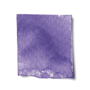
Purple
Purple is associated with royalty and richness. In deeper shades, it can convey that same mood of luxury, while lighter shades, such as lilac and lavender, are considered more soothing. Purple is also thought to stimulate creativity and is sometimes considered exotic. It is often recommended for bedrooms, bathrooms, offices, or accents in main living spaces.
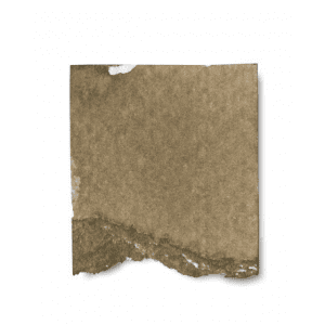
Brown
Brown can convey feelings of strength and durability, and it is thought of as a grounding color. It is a great neutral that can go from a comfortable wall cover in lighter shades to a rich accent in darker shades.
The bottom line is that you have to choose colors most closely aligned with your personal goals for your space. They can have a wide range of effects on mood and mental stimulation, as seen here. By analyzing the different colors as well as different shades and potential uses, you’re sure to find a color scheme that will transform your house into your perfect home.
HEALTH
Menu
BEAUTY & STYLE
Menu
LIFE
Menu
RELATIONSHIPS
Menu
FOOD
Menu
FITNESS
Menu
PERSONAL GROWTH
Menu
ABOUT US
Menu
Get access to the next issue before it hits the stands!